norimo
MS Paint Child

Posts: 5 
|
Post by norimo on Jul 10, 2017 8:41:40 GMT -6
norimo's OC Design [Compare and Contrast] Hello! I'm norimo and I'm often looking for new ways to invent and create unique but memorable character designs, or at least ones that make a person interested about the character initially.
My goal with this thread is to upload a select few of my characters at a time, and have people comment in this thread which design out of the few strikes them the most, and preferably state why. If any of you are familiar with my OCs or have seen my designs anywhere else and have a particular favorite, you are free to mention them at any time! Your opinions help me. During these periods, I may issue info about the OCs listed or a prompt I had wanted to follow when creating them, to which I am seeking replies that comment on which design they feel better represents what I had been trying to achieve. However, if there is a post without a prompt or info, it is fine to simply choose out which one you like better.
As of right now, I am not exactly looking for revisions. I'm trying to revise designs out of my own accord so please refrain from posting images of a design you may have created in another's place. This is to test my own ability; I need to be able to create these my own! However, this does not exclude pointing out what you feel are extraneous elements I may have implemented in a design. You can make suggestions, as long as they don't cross over into making a design for me. (Proper way would be: "The cloak design can be simplified, it feels too complex." "I feel more color would spice this up." An incorrect ex: "Add ___ to ___" "[inserts hand drawn image]")
I'll be adding a post in a bit! Feel free to comment before I do so. |
|
|
|
Post by funnybunnyjay on Jul 10, 2017 10:42:50 GMT -6
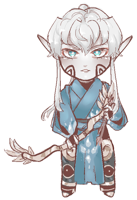
Delphi from Thorns is one of my favorites among character designs that you've made. The design looks creative and cool at the same time. The eyes being covered also make her look a bit mysterious. I also like how Anies looks. The white skin and white hair makes the character stand out and works well with the blue outfit. The marks on the face also look cool. Also I can't remember this character's name but I like this design as well. It's harder for me to describe what I like about this design. The color choices and the serious face on the right give me the impression that there's more to this character than a typical princess character I guess. |
|
norimo
MS Paint Child
Posts: 5
|
Post by norimo on Jul 13, 2017 8:00:24 GMT -6
Thank you for your input! It's very appreciated. Especially with the comment on Delphi's hood- it made me think how I could possibly spark questions with a design and create a hook to a character. First RoundThis one's pretty simple, I'm not going to give much of a prompt as much as I want to know which you simply like better and why. I'll be using an aforementioned design below already haha.
 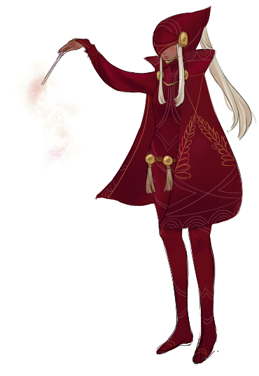 Eliza vs. Delphi! Eliza vs. Delphi! |
|
|
|
Post by funnybunnyjay on Jul 13, 2017 12:42:22 GMT -6
I pick Delphi for reasons that I've already stated lol. Delphi is my favorite out of your character designs. I thought about mentioning Eliza in my earlier post because I like the black and gold outfit but from the neck up Eliza looks more ordinary than Delphi. Maybe Eliza could use glasses or more noticeable face marks or something to make her face more distinct, because as it is now I have no clue what her personality is based on this current design. Eliza's design is good and I don't think it necessarily needs to be changed but I think the best character designs have a strong sense of personality to them if that makes sense.
[EDIT] Here's a video from one of my favorite youtube analysts named "Super Eyepatch Wolf" who does a better job at explaining my point about conveying personality through character design than I did lol.
|
|
norimo
MS Paint Child
Posts: 5
|
Post by norimo on Jul 13, 2017 15:28:02 GMT -6
I pick Delphi for reasons that I've already stated lol. Delphi is my favorite out of your character designs. I thought about mentioning Eliza in my earlier post because I like the black and gold outfit but from the neck up Eliza looks more ordinary than Delphi. Maybe Eliza could use glasses or more noticeable face marks or something to make her face more distinct, because as it is now I have no clue what her personality is based on this current design. Eliza's design is good and I don't think it necessarily needs to be changed but I think the best character designs have a strong sense of personality to them if that makes sense. Awesome input! When thinking critically, I definitely agree that in comparison- Delphi appears more serious with her concealed face and gives the impression she is hiding something, creating an air of mystery. Her outfit is in fact- a uniform from her home Loukios that most clerics adorn, but her need for a hood specifically suggest more about her character. It also suggests her shyness due to being closed off (covered) from the general outer world. Whereas Eliza's visual cues are less in reference to her personality but rather her overall character arc. My basing for Eliza's design included a butterfly motif as Eliza is a character who 'evolves' and goes through transformations. Her powers are also insect-like as she uses her magic to glide down with her coattails and vines to create a coccoon. It is in reference to Eliza's past and future, as she is a character who started out humbly from the slums and bloomed into a prodigy. (Caterpillar to butterfly) While the turqoise streak on her face is a signal for upcoming turbulence, there can be more possibly done to convey Eliza's sense of distress in her current predicament. Thus I can possibly think about how to further express her personality while combining elements that symbolize her growth or destruction. Thank you! |
|
|
|
Post by mangolee on Jul 13, 2017 15:37:53 GMT -6
I really like Eliza's color scheme. Having it be mostly black with an INTENSE pop of teal makes your eyes got right to the butterfly motif, which I'm assuming is the main part of her design. Having it be mostly black also makes the little color that there is in the design stand out more than if it were another neutral color.
|
|
|
|
Post by Cassiroll on Jul 13, 2017 15:45:34 GMT -6
I suggest adding some sort of more prominent teal balance to the top of the character, it may help even out the design. (Edited after realizing my original critique may be what you wanted us not to do--being too specific.)
|
|
schribbit
Overused Theme Song
Alas, I'm merely a potato. Icon commissioned from @gunny
Posts: 103
|
Post by schribbit on Jul 13, 2017 16:29:11 GMT -6
I have to agree with the majority of what was said about both of the characters!
How I'm going to choose to look at this for the following paragraphs is that I'm going to look at JUST silhouettes- as everyone has already made good points on colors, interest and such-
When you look at Eliza's silhouette, with the puffy shoulders and the soft downward curves of her jacket in the back- she seems very nice and calm, maybe shy. There's something very nice about it, almost welcoming. Whether it was intended, she seems like someone who could be friendly and nice to talk to.
When you look at Delphi's silhouette, the cape makes her very mysterious, and gives little to go on in the torso/main body region. However the sharp edge of the cape at the bottom and at its collar suggest someone with a strong personality- something sharp in itself. The hood in the silhouette also adds to this in a very noticeable way, more so than the cape, in fact. The hair falling from it also adds something interesting, though it has little emotional response. It's just an interesting shape in general.
The one thing I must say about both of the silhouettes however, is that while there are a lot of interesting things happening from the main body and up, there is little to go off of in the leg/foot region. They are interesting to look at when you look at them with all the colors and shapes in the actual design, but as it stands as a silhouetted shape, there isn't much there. While this still makes for interesting design, it's just something I thought to mention.
Now, to talk about their designs with all the imagery in mind.
Eliza's outfit has a lot of fun- but dulled down- detail, something that makes me think she likes the interesting patterns, but doesn't want to stand out too much. The colors and shapes combined with the silhouette however, make me think different. The puffed arms with the frills, the cape with the intricate color design, the collar, and her leg/foot design- it all makes me think it is something she deliberately wanted to have for some sort of attention grabber. It is no negative matter, it just seems like the combination of dulled/little colors and friendly shapes makes me think she would like to be friends with others. Her design is mostly welcoming, though the main dark color does bring that back a bit.
Delphi's outfit seems very official and efficient, yet partially in the way. With her wand, it is obvious she is a mage- with the cape being cut off mid leg, it makes me think she might be doing some moving around, though not to the extent of someone who would be doing TOO much twisting and moving. She seems like she might not do much physically- her body type also suggests this. Her body suit would seem to make for easy movement and even comfort, and the cape allows for a bit of hiding. While the mask and the hood makes me think she is mysterious and strong, the cape makes me think she is fine without having too much attention. The colors chosen do make me rethink this however, as they are very bold and eye-grabbing. Reds and golds are naturally things that stand out, in most areas she would be sticking out quite obviously. The tassels with the large beads also help to give something interesting to look at. At face value, they are fun and fancy- something unexpected for such a vibe that the rest of the outfit gives off. When thinking about the outfit in general however, the mask and hood make me think she is part of something where these tassels are part of their general look. They make me think they stand for something important.
While I've said all of this, I would like to give my opinion based purely on personal taste. I think Eliza's general outfit design is very nice and interesting to look at, the dull gold plus black is a nice combo, along with the welcoming pop of teals. Delphi is a bit of an enigma and that is likely purposeful- I like her general look, the large hood/mask is a very cool idea and I've always admired it- the full body suit is nice with all the small details in it. I love red as well, so Delphi in general is someone I like looking at because of that.
So, this turned out much longer than expected. Sorry about that, though I hope something in it does help.
|
|
norimo
MS Paint Child
Posts: 5
|
Post by norimo on Jul 13, 2017 17:26:32 GMT -6
Don't worry about the length! I'm very glad you chose to mention silhouettes- as the overall shape of designs is very important to me and can be what I consider most initially. Your evaluation is important. The breakdown of what you receive from both of these designs is extremely helpful as well, and I'll keep your associated meanings with these visual signals close as I consider my designs. I'm pleased with the connotations you attached to them! Thank you for the input. |
|
Allie
MS Paint Child
Posts: 36
|
Post by Allie on Jul 13, 2017 18:27:58 GMT -6
I do like Delphi, but I feel her design could use a different shade of that red somewhere else to give the design more value distribution, such as the body suit. It would help to break up some of the shapes and give more definition.
And as Jay said, giving Eliza something on her head could help give the design more impact, especially if it's related to her butterfly motif and follows the general color scheme (like a certain hairstyle or some hair accessories). Balance is key, whether balanced or intentionally unbalanced lmao.
|
|
arenia
MS Paint Child
Posts: 5
|
Post by arenia on Jul 15, 2017 9:19:00 GMT -6
What Delphi really has going for her is her silhouette. Theres not really another character in either official or fanmade media that I can think of with her shape. The sharp helmet, billowed cape, and skintight fabric on the legs makes not only a very appealing shape, but an immediately recognizable one. A factor for successful character design, perhaps the most important factor, is a recognizable silhouette. If I were to black out Delphi and Eliza's pictures entirely to make yhem nothing but outlines, I could recognize the former but most likely not the latter. Thats not to say I'm not in love with Eliza's design. Actually I love her outfit and its one of my favorite clothing designs you've done, with that pop of color amidst the black and gold. But in terms of character design, pushing her silhouette would make her stronger. She has so many interesting details like her collar or sleeves or coattails or even her hairstyle that could be pushed further that would make her overall shape more successful. |
|


 No seriously, here's the link:
  Messed up life situations got in the way, and now no one entered anything, even me. I'm sad...